Empire Communities Rebranding
Context.
Empire Communities is one of Ontario’s leading real estate developers. Back in 2014, they were at a crossroads, facing a perception problem among luxury consumers. With a dated look and feel, and a lacklustre tone of voice, the Empire brand wasn’t doing justice to their actual home and condo design. Modern and luxurious, Empire’s portfolio of master-planned communities deserved a master-planned brand.
Insight.
In the wake of a major worldwide recession, luxury needed to pull more weight. It needed to be more than a Faberge egg. It needed to have a practical side. To that end, the rise of a whole new brand category—affordable luxury—was gaining traction in the housing market and beyond.
Idea.
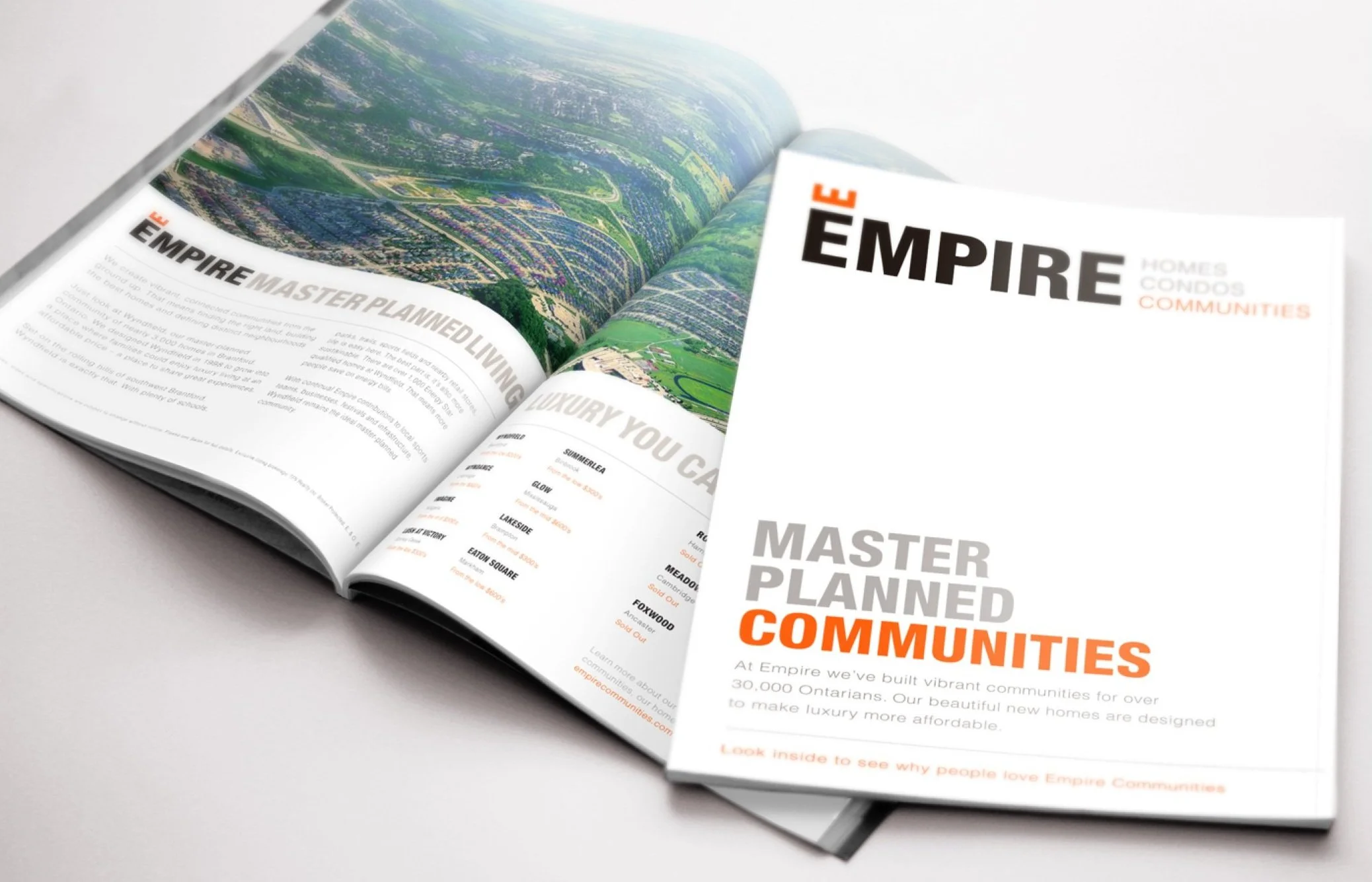
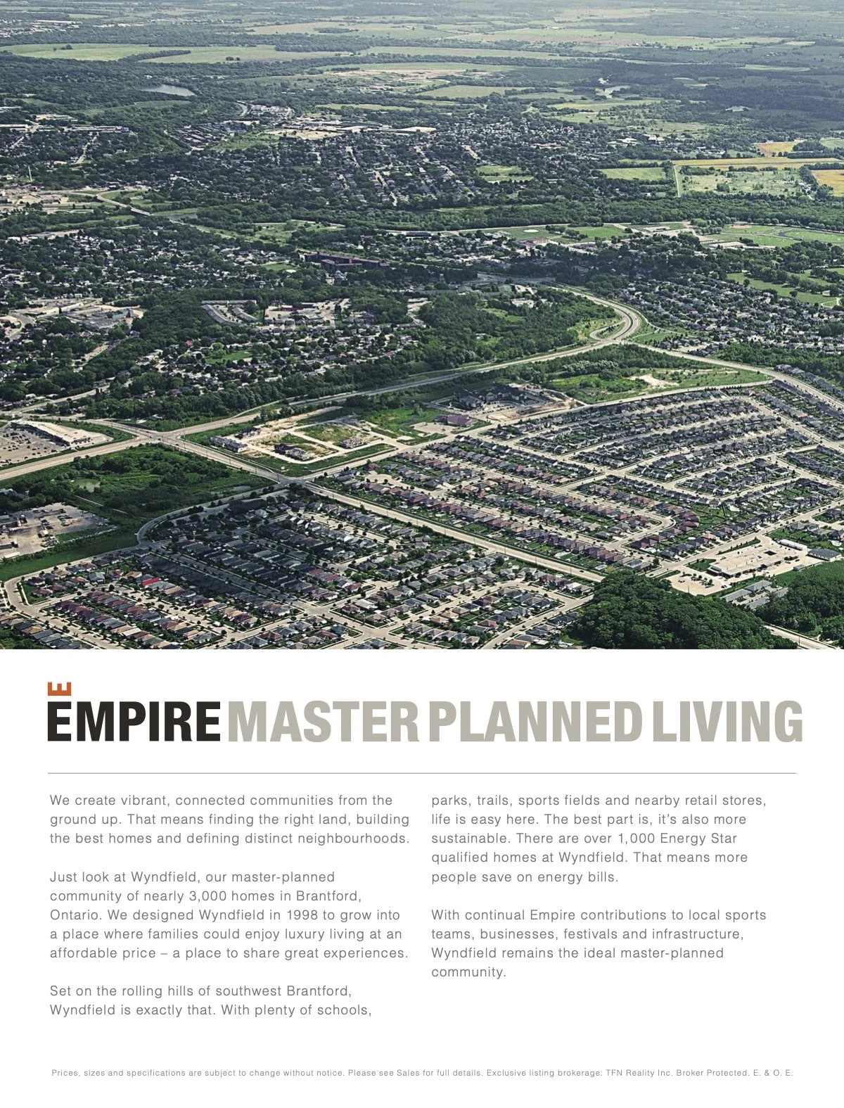
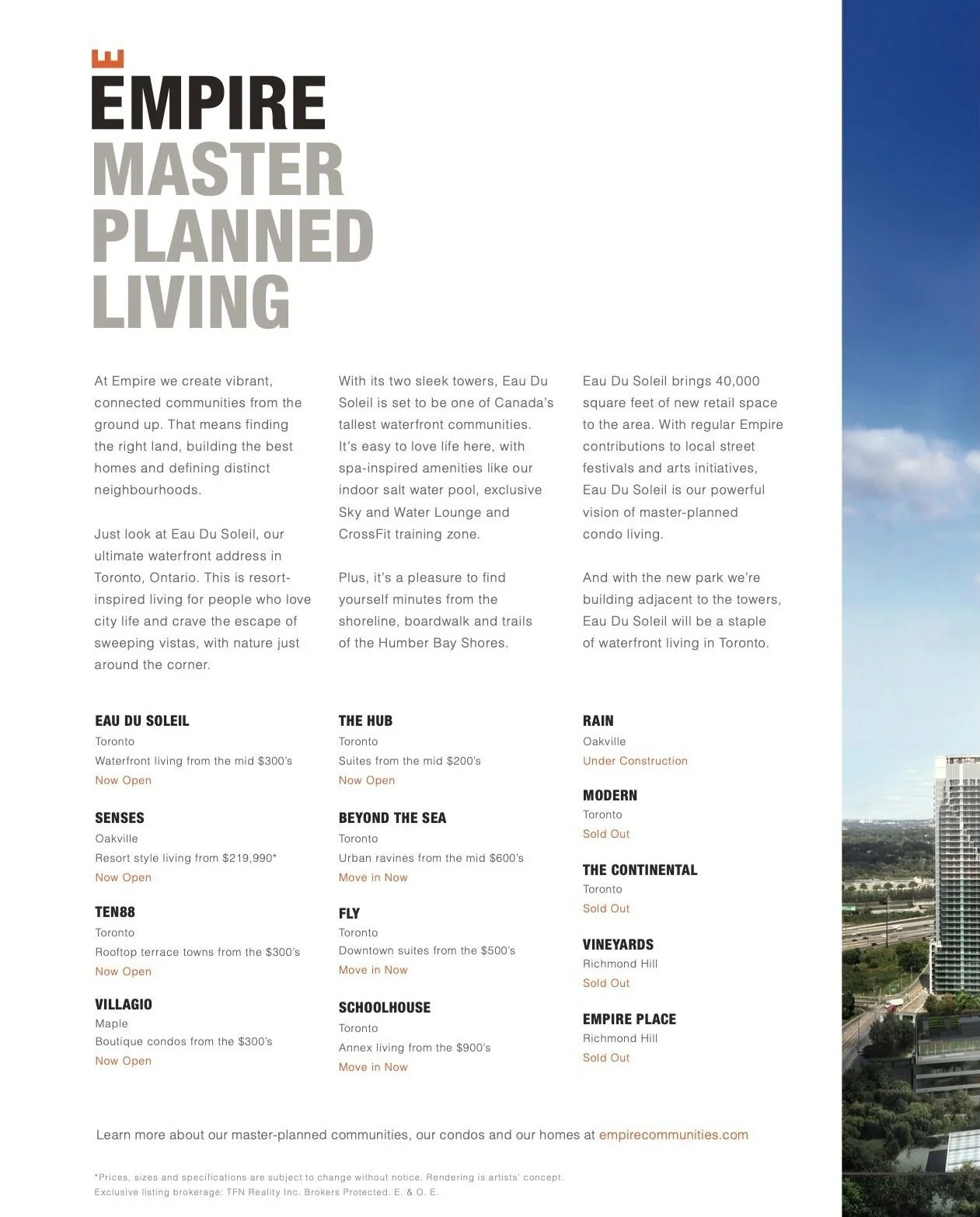
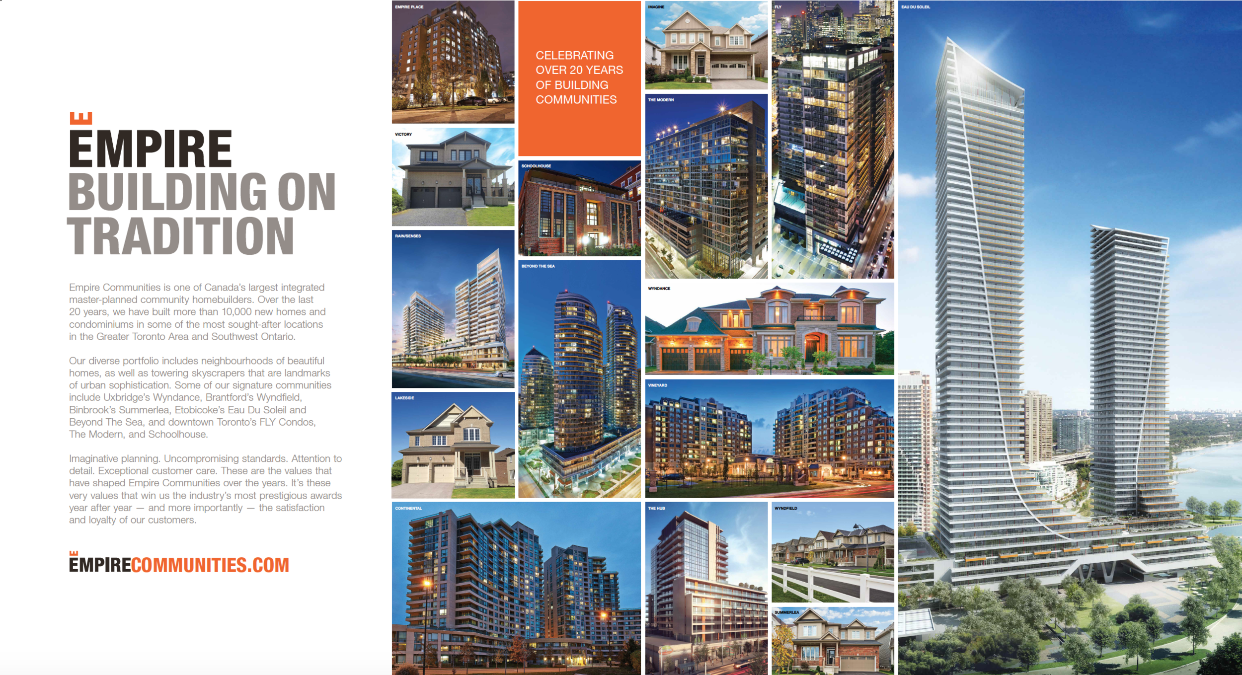
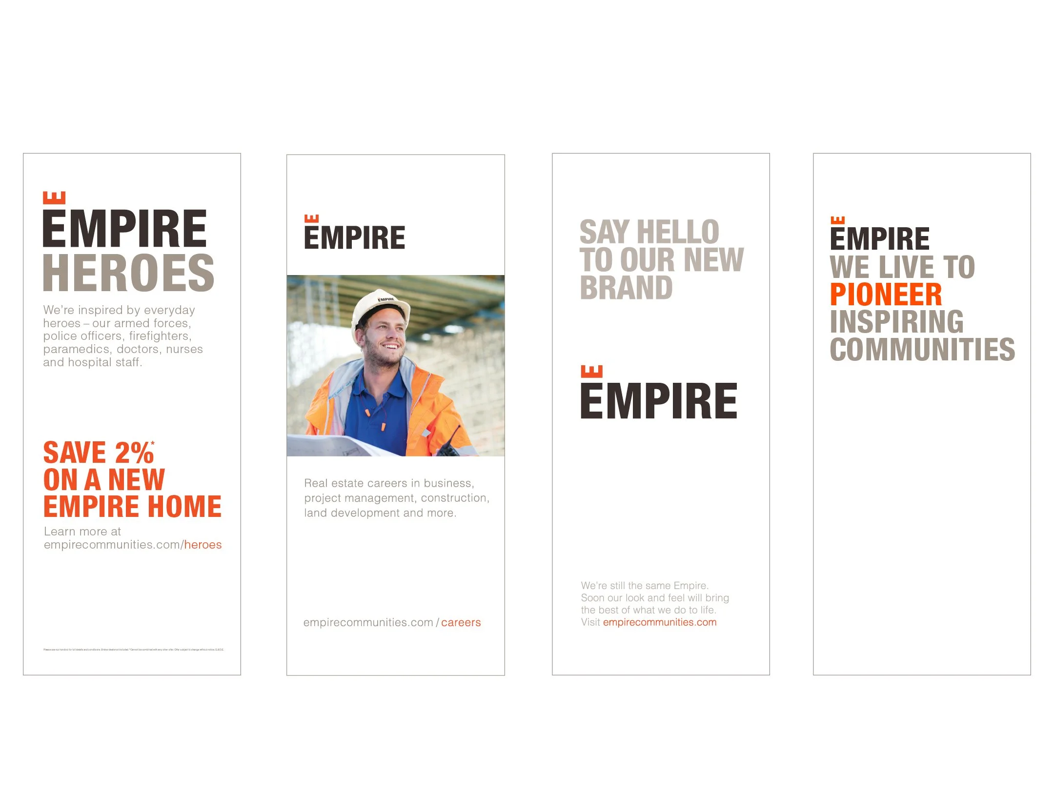
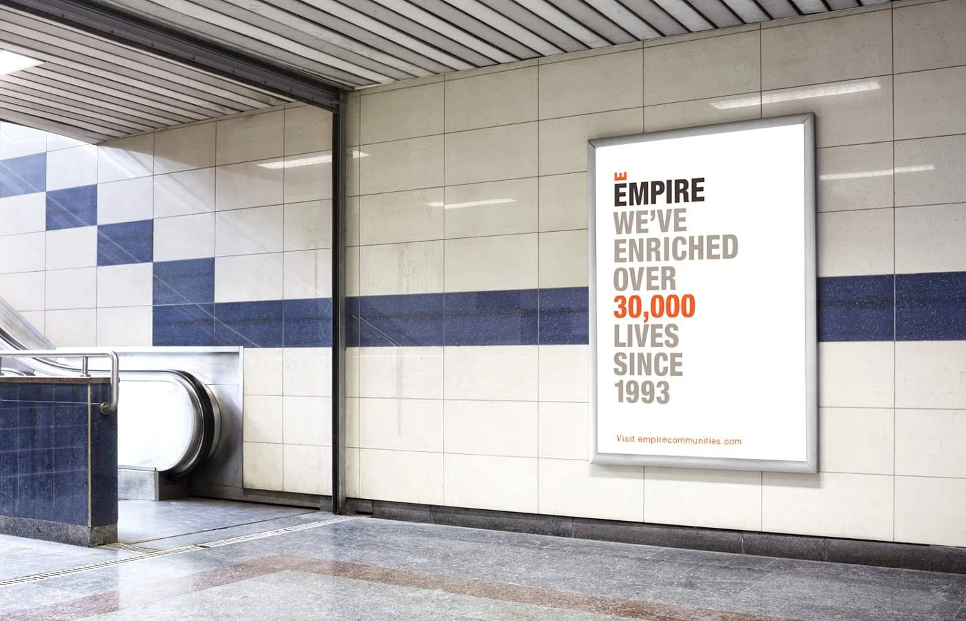
We started from the ground up, with a whole new brand strategy. From promise to personality to position, we defined the intangibles that would guide all creative expression. Then we articulated what Empire Communities stood for. Penning some refreshed ‘About Us’ content, we established a new baseline for the brand’s communications. Finally, we rolled out a radically reimagined visual identity.
Leading up to activation, we brought it all to life through an array of collateral, not to mention editorial content for a swath of home and condo publications. The language needed to reflect Empire’s purpose to pioneer inspiring communities, while laddering back to the positioning statement of Luxury You Can Afford.